One of your company’s largest losses of the year could be a simple thing like a safety sign. You might be startled by this. In the last decade, I’ve had three clients lose a lot of money because of a sign that was the incorrect colour, the print was sloppy, or the business didn’t have a significant policy or proper safety sign training in place.
Let’s get started by establishing a sign policy in the first place. I usually tell clients that the policy they draft is only as good as the training they deliver when they roll it out and help them develop any policy. The ANSI Z535 safety sign standard would be the first place I’d look if I needed to research signs for a significant policy. That’s where industry-conducted studies and tests on creating and using effective safety signs are found. You’ve done your homework, and now you’ve got a plan in place to make sure the signs you put up are successful. Worker and public safety are both improved and the employer is protected by your new policy. Unless your workforce, the facilitator who delivers signs, and those who install or maintain signs understand the sign colour, size, print and placement, your sign program will be ineffective. If the signs are damaged, worn out, or illegible, or if they need to be moved, this is especially true.
Your next logical question is, “Why should employees be aware of safety signs?” There are numerous explanations, all of which have been scientifically proven. OSHA and MSHA, for example, are well-versed in the effectiveness of safety signs as part of a comprehensive safety strategy. Only a portion of the job entails putting up signs. A strong safety program is made up of a number of interconnected components that work together to create a safe working environment. Safety signs are more likely to be observed and obeyed by employees who have been educated on their purpose and function. Instilling a sense of pride and responsibility in your staff by teaching them about the significance of signs and how to maintain them in good working order is a smart investment. Safety sign training isn’t a one-day event. However, with only a few minutes of instruction, workers can use safety signs as a tool to help keep their workplaces safe. A company’s signage is there to keep the public safe from the risks linked with the company’s operations. Lake, ditch, and driveway warning signs include those that mention alligators and hidden drives as well as those that mention speed limits, trucks entering and exiting, electrified equipment and radio frequency power.
ANSI sign standards are put to the test to see what impact signage and warning symbols have on those who see them. In order to maintain uniformity, these useful sign structures are then classified and standardized. The colours and pictures of a safety sign have trained workers and members of the public to behave in a certain way. When I use the term “conditioned,” I mean that a warning sign’s consistency in terms of colour, images, and shape is instantly recognized as such. As a result of the Manual on Uniform Traffic Control Devices, hardly one pays attention to stop signs. Drivers naturally slow down due to the vehicle’s size, shape, and colour. For example, a few years ago, an artist decided that stop signs were uninteresting, so he replaced several ordinary stop signs with artistic versions utilizing a variety of colours and images. For the artist, this led to a deluge of road accidents and incarceration.
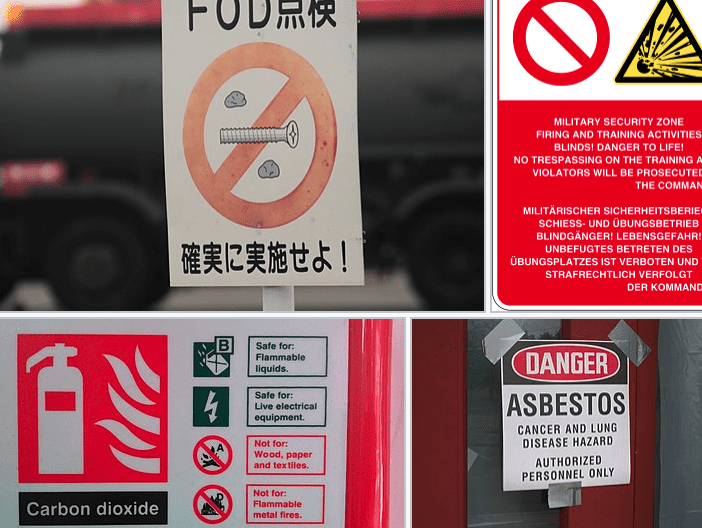
There must be three separate panels within a sign to comply with the ANSI safety sign standard. The signal word panel, the message panel, and the symbol panel make up an effective signage system. There is only one word that serves as a signal word: “DANGER.” The warning is brief and to the point, with words like “High Voltage,” “Poison,” or “Wild Animals” describing the danger. It is another way to reiterate the message for individuals who may not fully get it. Numerous groups of people of diverse ages, education levels, ethnicities, and cultural backgrounds have been surveyed on their reactions to seeing the symbols. The efficacy of the sign is derived from the three panels and the coloured backgrounds. White lettering on a red background represents “DANGER.” There are black letters on an orange backdrop for “WARNING.” “CAUTION” is written in black on a yellow backdrop, whereas “NOTICE” is written in italics white on a blue background. There is white lettering on a green background reading “SAFETY INSTRUCTIONS.”
The placement of warning signs is determined by the hazard’s approach and the angle from which the hazard can be seen. If a person can’t notice the sign-in time to prevent a hazard, it shouldn’t be put up at that location. Signs can be placed more easily in a workplace where staff have been trained to recognize them. It is not specified in the MUTCD how many or where the signs should be placed. In order to identify where and how many signs are necessary, the property owner must evaluate the passing public and the amount of danger, keeping in mind that approaching individuals must be able to notice and react to the sign’s message in time to avoid the danger being presented.
Real-World Case Studies
Earlier in this post, I discussed the expense of bad environmental signs. This is a list of real-life examples when safety signs were ignored.
In the first instance
A substation was erected by a utility. The barbed-wire fence that surrounded the substation was seven feet tall and had three strands. In addition, the fence had to be at least 18 feet away from any structure in the substation at all. The back fence of the substation was flanked by a hedge on the outside. An 8-foot-tall hedge surrounded a 12-foot-long fence. Every 30 feet along the 240-foot-long fence, the crew added “HIGH VOLTAGE” red-and-white warning signs. Soon after, an intruder who had previously committed burglaries and thefts scaled the barbed-wire fence with little difficulty. A few minutes later, he was electrocuted when removing the 4/0 ground from the substation power transformer. His body was discovered by a member of the station’s maintenance staff. The coroner stated that he had been at the substation for three days before he died.
An injury complaint was filed against the utility within 72 hours, citing the National Electrical Safety Code’s Section 11 and other relevant codes as grounds for liability (the American National Standard for Environmental and Facility Safety Signs, ANSI Z535.1, .2, .3, .4 and .5). To put it simply: The suit was successful because of one small line in ANSI safety sign standard 8.2.2, which reads, “Determination of safe viewing distance for the message panel text shall take into consideration an appropriate reaction time.” An ANSI requirement should only apply to employees, the utility company contended. The jurors were correct — and the judge was wrong. According to the plaintiff’s evidence, the victim’s ladder was positioned almost exactly halfway between the two nearest warning signs. The plaintiff further showed that the local guy could not see the faces of the signs when he emerged from the hedge utilized to disguise his illegal entry for criminal purposes. The relatives of the dead received a multimillion-dollar award as a result of that single debate.
Could training on sign placement and purpose have led to an organizational shift in the utility’s policy? Would the incident have occurred if the sign installers had noticed the issue with sign placement and positioned the signs at an 8-foot interval? In this case, no one can dispute the deceased’s intention or assumptions. What is obvious is that the standard of care was not met by the placement of the signs.
Case 2:
A highway engineering and construction company set up shop on an empty 3-acre property. Supplies for the construction of the road were kept there. The lot was direct across the street from a row of houses. A residential street entry was just across the street from a neighbourhood market located next to the construction site.
A single-phase power wire that crossed the construction lot entry was neutralized by an incorrectly loaded material truck one morning. An explosion shattered a copper primary, sending it down to the construction site’s broken stone cover. The road personnel said that the wire started to smoke at first, but then slowed down and ceased. They made the decision to put up a sign. A sawhorse was used to hold a 4 by 8 sheet of 5/8 plywood. They sprayed “Don’t Touch the Wire” on the board in bright orange fluorescent marking paint. They went back to their work location, which was about 100 yards away, and reported the downed wire to the utility company.
Later, a pedestrian from the nearby residential neighbourhood crossed the street and entered the construction site, heading toward the market in less than 15 minutes. She stepped on a downed wire and was electrocuted just as a utility worker arrived at the scene. A member of the two-man crew used hot cutters and rubber gloves to cut the wire while the other member of the crew performed CPR on the victim. The first man drove to the fuse and yanked it, causing it to explode. The victim died despite their best attempts.
When the deceased man’s family brought legal action against the engineering firm, they were successful. Their negligence suit was based on the ANSI sign standard. The plaintiff acknowledged that the personnel were concerned about the public’s safety. Because it did not conform to the ANSI standard in size, shape, colour, or message, the plaintiff’s claim further established that the victim was unable to recognize the sign in question. Accidentally, the wire came down, but the crew was aware that there was still a danger. That’s why the sign was put up. Their efforts were admirable, but they fell short of the ANSI standard of care. While the crew could have remained on the scene to issue a warning to oncoming passersby, instead they erected a caution sign. It all made sense to them since they were aware of the nature of the danger. They could make sense of the message since they were aware of the wire’s presence. Because it is the hue they use to post warnings on the ground where underground impediments are known to exist, it made sense to them that the colour had been chosen. Fortunately for the crew member, however, the pedestrian did not have any prior information or expertise that would have allowed her to see the danger that the warning clearly indicated.
Colours, danger symbols, and warning statements have a repetitive and predictive effect, indicating that a hazard is present, according to the ANSI sign standard. Such a sign would have been impossible for highway workers to put up in this circumstance since they didn’t have the resources to do so. However, the workers should have known that their plywood construction was ineffective and noncompliant in the face of such a life-threatening hazard if they had even the most basic understanding of sign function and purpose. The crew-made sign suggestion would have been rejected by a skilled worker, who would have instead set up watchers to keep the area free.
Conclusion
Regarding the old “DANGER” sign with a red oval and white “DANGER” letters on a black backdrop, does anyone recall that? The three-panel form was introduced in 1991 after studies revealed its benefits. However, the ANSI standard allows for the temporary use of the old red oval in order to facilitate the conversion. When the oval symbol was removed from the standard in 1998, it was no longer deemed compliant. Even though they were deleted from the ANSI standard, you can still purchase them. Installing red-oval “DANGER” signs, on the other hand, is no longer deemed acceptable. Bottom line: You must know these consensus standards and apply their guidelines to your own safety programs, both for the sake of protecting your workers as well as for the sake of ensuring the safety of your enterprise.